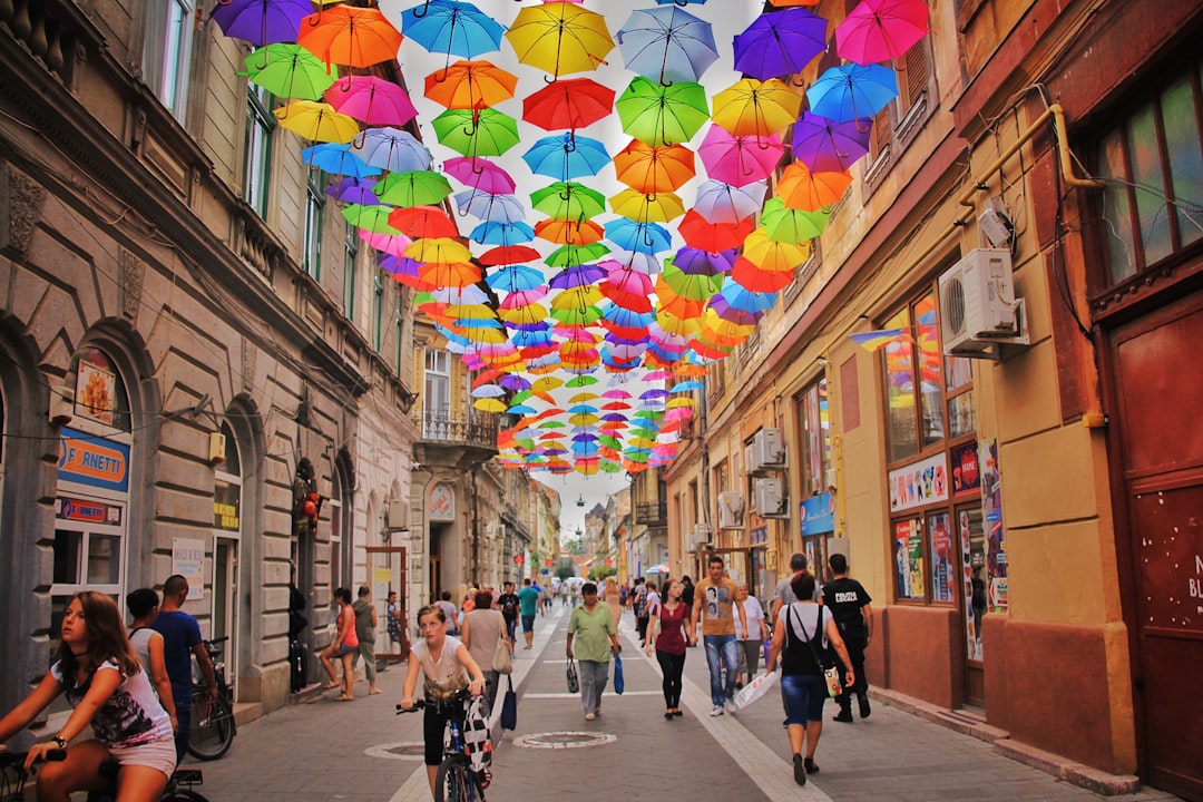
Ramadan campaigns are often expected to do two things at once: feel warm and festive, while also signaling faith, family, and generosity. That pressure can push creators toward images that are instantly legible but culturally thin—glowing lanterns, anonymous silhouettes, and sentimental scenes that flatten a lived month into a mood board. The result is not only visually repetitive; it can also become ethically risky when Ramadan is reduced to hardship, nostalgia, or a vague “Middle Eastern” aesthetic with no regional specificity. If you are building respectful branding, community-centered design, or Ramadan storytelling for a diverse audience, the goal is not to avoid emotion. It is to make emotion more truthful, more grounded, and more human.
This guide draws on the same critical lens that helps us question reductive regional storytelling elsewhere: a visual language that turns complex communities into symbols of suffering or simplicity. Creators who want to avoid that trap can borrow from editorial rigor, cultural context, and design sensitivity. That means learning how to build authentic narratives through detail, memory, and place—rather than relying on formulaic sacred-season tropes. If you are also assembling assets, templates, or campaign systems, you may want to pair this article with our guides on Ramadan design templates, social media kits, and cultural guides for a stronger foundation.
Why flat Ramadan storytelling misses the point
Suffering is not the story
One of the most common failures in seasonal faith content is the assumption that “serious” equals “somber,” and “meaningful” equals “suffering.” Ramadan can certainly include sacrifice, fatigue, hunger, grief, and discipline, but those experiences do not define the month on their own. They coexist with routine, humor, hospitality, anticipation, spiritual focus, and the ordinary logistics of life continuing around prayer schedules and iftar planning. When a campaign centers only deprivation, it turns a multidimensional practice into a moral lesson for outsiders.
This is where visual ethics matters. Designers must ask whether the image is inviting people into lived experience or harvesting emotional weight for aesthetic effect. The same judgment applies in other forms of community storytelling, from accurate explainers on complex global events to guides on marketing sensitive content without burning bridges. In both cases, audiences notice when the creator is performing empathy instead of practicing it. Ramadan deserves the latter.
Stereotype thrives when regional detail is erased
“Ramadan aesthetic” too often collapses many cultures into a single visual shorthand: gold crescents, mosque silhouettes, abstract patterns, dates, prayer beads, and soft gradients. Those motifs are not inherently wrong, but they become problematic when they are the only language available. A family in Jakarta, a neighborhood in Amman, a household in Lagos, a suburb in Toronto, and a coastal community in Tunisia may all recognize Ramadan differently through food, sound, time, clothing, architecture, and social customs. If your campaign ignores regional specificity, it can feel decorative rather than relational.
Think of the difference between broad genre packaging and genuine place-based storytelling. In the same way that readers expect careful framing in coverage such as event coverage playbooks or community responses to local crisis stories, Ramadan content should signal that it knows where, and for whom, it is speaking. Specificity builds trust because it proves attention. Without attention, even beautiful work can feel extractive.
Sentiment without context can become performance
Many Ramadan visuals lean heavily on warmth: glowing lights, hands raised in prayer, steaming food, and children in festive settings. Warmth is not the problem. The problem is when warmth is detached from context, history, and use. A sentimental image of an iftar table may look welcoming, but if it ignores class differences, migration experiences, accessibility needs, or local customs, it tells only part of the story. The audience may feel the emotional cue but still sense the absence of real life.
Creators can learn from publishing strategies that prioritize trust over spectacle, like bite-sized news that earns trust or how to spot influence campaigns and misinformation. In each case, the best content does more than trigger attention. It gives people enough context to orient themselves honestly. Ramadan campaigns should do the same.
What dignified Ramadan narratives actually look like
They start with real people, not symbols
Dignity begins when you treat people as participants in a culture rather than as carriers of a theme. Instead of opening with generic lantern graphics, build your concept around a person’s routine: a shopkeeper arranging dates before sunset, a student studying between prayers, a parent coordinating dinner while responding to family messages, or a grandmother folding napkins for guests. These images feel ordinary, but that ordinariness is precisely what makes them credible. They suggest the month is lived, not staged.
This approach aligns with community-centered design principles used in other sectors, such as partnering with underserved communities and designing systems around real user needs. Dignity is not an abstract tone; it is the consequence of choosing subjects, scenes, and details that respect actual life. If you’re making an asset pack, build around scenarios, not just icons.
They recognize Ramadan as a rhythm, not a mood
Ramadan is a schedule, a sensory experience, and a social architecture. It changes the day: early mornings, fasting hours, subdued afternoons, the energy shift before sunset, the concentrated calm of prayer, and the renewed social life after iftar. A strong campaign reflects that rhythm. For example, a carousel could move from pre-dawn preparation to midday reflection to the collective transition at dusk, rather than showing only the “beautiful” final table. That structure creates narrative motion and avoids the static postcard effect.
If you’re designing for social platforms, this rhythm can shape content series, motion design, and copy cadence. A short-form approach works best when each frame advances understanding instead of repeating the same symbol. That’s similar to how support teams use smarter triage or how workflow tools improve consistency. Good systems reduce friction while preserving nuance. Ramadan storytelling should too.
They make room for plurality
There is no single Ramadan look, no single Muslim household, and no universal aesthetic that can stand in for a global religious month. A campaign rooted in dignity leaves space for multiple genders, ages, class positions, languages, and regional practices. That means moving beyond the assumption that every scene should be visually luxurious or universally serene. Some households are joyful and bustling; others are quiet, tired, or navigating grief. Both can be true.
Designing for plurality is not a compromise; it is stronger creative strategy. The same principle appears in content about research reports that serve different audiences and in guides like survey tool buying guides, where usefulness depends on accommodating variation. The best Ramadan narratives do not force one emotional register. They create a coherent frame wide enough for real life.
A practical framework for culturally nuanced Ramadan design
Step 1: Research the community, not just the holiday
Before choosing colors or writing captions, identify the specific community you are speaking to. Is the audience local or diasporic? Arabic-speaking, Urdu-speaking, Turkish, Malay, Somali, or multiethnic? Are you designing for a faith-forward audience, a family marketplace, a publisher, or a brand campaign? The more precise your audience definition, the less likely you are to default to generic symbolism. Research should include local Ramadan customs, meal traditions, charitable practices, common greetings, and visual references that belong to the audience rather than to an imagined outside observer.
For creators building commercial assets, this is also a licensing and production issue. Sourcing culturally resonant details well can save time and reduce revision cycles later, just as smart planning improves outcomes in analytics partnerships or benchmarking workflows. Better input yields better output. In design terms, that means fewer guesses, fewer clichés, and fewer costly misreads.
Step 2: Separate sacred, social, and commercial layers
Ramadan imagery often blends spiritual cues, family scenes, and product promotion into one visual soup. That can work, but only if you understand which layer should lead. Sacred visuals should be treated with restraint and precision. Social visuals may be warmer and more casual. Commercial visuals can be energetic, but they should not instrumentalize prayer or fasting as mere decoration for sales. A respectful brand does not put a sacred phrase beside an incongruent product without intent and care.
This layered thinking is similar to how effective editorial systems distinguish between awareness, education, and conversion. You can see the value of that distinction in work like reusable webinar systems or packaging that shapes first impression. The best Ramadan branding is not louder than the moment it serves. It is aligned with the moment’s meaning.
Step 3: Use reference boards with regional anchors
A responsible mood board should include more than lanterns and arches. Add location-specific food, textiles, domestic settings, neighborhood architecture, typography styles, calligraphic traditions, and photographic references that resemble the actual community. If your concept is for Gulf audiences, the textures may differ from North African, Levantine, South Asian, or African Muslim contexts. If it is for diaspora audiences, include hybrid spaces like city apartments, university cafeterias, and community centers. These anchors bring specificity into the creative process early enough to matter.
When you need a mental model for building a reference system, think of the structure behind cross-channel data design patterns: one clean framework can support multiple outputs without losing integrity. In design, that means your core system can hold many local expressions while still looking intentional. This is especially useful for agencies and publishers creating Ramadan campaign toolkits at scale.
Visual ethics: what to avoid and what to do instead
Avoid anonymous hardship imagery
One of the easiest ways to flatten Ramadan is to treat fasting itself as the entire emotional story. Images of tired faces, empty tables, and dim rooms may communicate struggle, but without balance they can suggest that the month’s purpose is deprivation. That framing is especially poor when the audience is not Muslim and may already carry outsider assumptions about religion and sacrifice. The ethical question is not whether hardship exists. It is whether hardship has been edited into spectacle.
Instead, show the full texture of the experience. Pair quiet reflection with practical preparation, community care, shared meals, and ordinary joy. The goal is not to sanitize reality. It is to avoid reducing a living tradition to a single emotion. For creators who work in adjacent areas, this is similar to the caution needed in sensitive museum experiences or community reconciliation after controversy. Respect grows when you stop mining difficulty for drama.
Avoid culture-as-decor branding
If your Ramadan campaign is built from stock icons that could describe almost any “Middle Eastern” event, it may be visually attractive but culturally hollow. Decorative motifs have their place, but they cannot carry the whole narrative. A crescent moon, geometric pattern, or mosque silhouette should support a deeper story, not replace it. Ask yourself whether the design could exist in the same form for any generic festive campaign. If yes, the work probably needs more regional character.
Consider how some product categories rely on differentiation through real function rather than surface polish, like seasonal party supplies or memorable pop-up experiences. Visual design behaves the same way. Motifs are not the value; meaning is the value. A culturally sensitive Ramadan composition uses motifs as evidence of attention, not as a shortcut around it.
Avoid one-size-fits-all color symbolism
Warm golds, deep greens, and midnight blues are common in Ramadan branding, and they can be effective. But color should not be chosen purely because it “feels Islamic.” Different communities associate color with different moods, traditions, and local aesthetics. In some contexts, saturated jewel tones feel celebratory; in others, softer neutrals or earthy palettes may be more authentic to the community’s built environment and textile traditions. The point is not to ban certain colors, but to connect them to a reason.
That kind of grounded choice mirrors the logic of good consumer guides, from purchase checklists to trend analysis. Buyers trust a recommendation when the reasoning is visible. Audiences trust a Ramadan visual system for the same reason: the palette should feel earned, not assumed.
How to build Ramadan campaigns around memory and lived experience
Use sensory memory as a design brief
Memory is one of the strongest tools for creating authentic narratives because it captures what broad symbolism misses: smell, texture, temperature, sound, and timing. Ask community members what they remember most about Ramadan, and the answers may surprise you. It might be the clink of dishes being set down, the sound of a neighbor calling across the street, the glow of a kitchen at sunset, the weight of a prayer rug, or the bustle of children in new clothes. These details are much richer than generic festive imagery.
When you convert memory into design, you create work that feels lived-in rather than manufactured. That approach is echoed in content that values precise, user-centered usefulness, such as micro-rituals for caregivers or sustainable planning for creator longevity. In both cases, the best advice begins from the real conditions of life. Ramadan visuals should do the same.
Show the in-between moments
The most memorable Ramadan storytelling often lives between the obvious milestones. There is the hour before iftar, but also the quiet commute home. There is Eid anticipation, but also the shopping list. There is prayer, but also the laughter around the table afterward. Campaigns that only show the polished peak moment miss the emotional architecture that makes the season feel real. In-between moments carry trust because they reveal process, not just presentation.
This is a strong place to use editorial sequencing. A print campaign, landing page, or social carousel can unfold like a mini-documentary: gathering, waiting, serving, sharing. For a similar approach to sequence and trust-building, study workflow efficiency for creators or support triage systems. Good structure makes nuance visible.
Let local language and greetings do real work
Language is not garnish. It is one of the fastest ways to signal whether a design understands its audience. Using a greeting correctly, pairing it with the right tone, and placing it in a composition that respects reading direction and hierarchy all matter. Avoid awkward transliteration or decorative Arabic that has no relationship to the audience. If a campaign includes multilingual copy, make sure each language is treated with equal dignity in size, spacing, and prominence.
This is where respectful branding becomes practical rather than theoretical. A thoughtful caption, a localized greeting, or a community quote can carry more authenticity than a whole page of generic ornament. It is the same reason audiences value clarity in pieces like internal policy writing or branded links for discoverability. Precision signals care.
Comparing common Ramadan visual approaches
The table below compares approaches creators often use, and shows which ones tend to support dignity, specificity, and cultural context better than the rest.
| Approach | What it looks like | Strength | Risk | Best use case |
|---|---|---|---|---|
| Generic festive Ramadan | Lanterns, crescents, gold gradients, abstract mosques | Fast recognition | Feels interchangeable and culturally thin | Basic seasonal placeholders |
| Sentimental hardship framing | Dim rooms, tired faces, sparse tables | Immediate emotional pull | Can reduce Ramadan to deprivation | Rarely ideal; only with strong context |
| Regional specificity | Local food, architecture, language, customs, clothing | Authentic and memorable | Requires research and localization | Campaigns targeting defined communities |
| Community-centered storytelling | Real people, routines, quotes, and lived scenes | High trust and emotional depth | Takes coordination and consent | Brand films, editorial, social series |
| Symbol-first minimalism | Small crescent marks, typographic systems, restrained color | Elegant and flexible | Can feel detached if overused | Premium brand systems, where context is already established |
The strongest Ramadan campaigns usually borrow from the last two rows: regional specificity and community-centered storytelling. They may still use symbols, but those symbols are anchored to real life. That balance is what turns a design from decorative to meaningful. If you’re building seasonal products, pair this with first-impression systems and seasonal promotion strategy for a more coherent campaign.
Practical production tips for creators and brands
Build a sensitivity checkpoint into your workflow
Before launch, run each asset through a simple cultural sensitivity checklist: Does this imagery flatten the community? Does the copy assume one geography or one class background? Are sacred elements being used respectfully and proportionately? Is the scene showing real life, or just a curated fantasy of piety? This review step should be treated like quality control, not an optional extra. It helps teams catch problems before the audience does.
Creators who work at speed may worry that sensitivity slows production. In practice, it often saves time because it prevents rework and reputational damage. That logic is familiar in other operational systems, such as digital onboarding or cross-functional governance. Clear checkpoints create faster, safer delivery.
Document what you learned for next season
Ramadan campaigns should get better every year. Keep notes on which references resonated, which assumptions were challenged, and which assets performed well in different markets. Record feedback from community reviewers, creators, translators, and client stakeholders. This transforms one campaign into a knowledge base, rather than forcing the team to relearn the same lessons each season. Knowledge retention is part of design sensitivity.
If your team manages many assets, a simple archive is invaluable. You can organize it alongside tools and systems similar to organized inbox alternatives or automation systems. The point is to make learning reusable. Good Ramadan storytelling gets sharper when each cycle informs the next.
Choose collaborators with lived or adjacent experience
Whenever possible, involve people who know the culture from the inside, or who have demonstrated long-term respectful engagement with it. That does not guarantee perfection, but it dramatically improves your odds of getting the tone, references, and boundaries right. Community review can reveal whether a phrase feels natural, whether a scene is accurate, and whether a visual reads as affectionate or patronizing. Lived experience is not a substitute for craft; it is a force multiplier for craft.
This principle is widely applicable, from reading work risk in cyclical industries to protecting valuables with the right systems. The best decisions are made with the right expertise in the room. For culturally specific campaigns, that expertise should be visible, not hidden.
Case study patterns: what works in real Ramadan campaigns
Pattern 1: The family table, but made specific
Successful Ramadan table scenes rarely succeed because the table itself is beautiful. They succeed because the table reveals a world. A Tunisian spread might emphasize harissa, brik, dates, and patterned ceramics; a Lebanese setup might foreground arak-free hospitality, pastries, and neighborhood gathering; a South Asian household may show savory fried starters, chai, and layered textiles; an East African scene may highlight shared plates, communal serving, and distinct regional ingredients. The more the table reflects actual memory, the less it feels like stock photography.
This kind of specificity is not a luxury. It is the core of trust. It resembles the difference between generic product placement and a genuinely memorable experience, as described in pop-up café storytelling and practical delivery design. Function and feeling reinforce each other when details are accurate.
Pattern 2: The quiet pre-dawn moment
Another effective storytelling pattern is the quiet scene before daybreak: preparing suhoor, checking the time, setting the kettle, or dressing children for a sleepy morning. This moment is visually understated, but emotionally strong because it captures care as labor. It also offers a better alternative to overused “golden hour” iftar imagery. The pre-dawn scene signals that Ramadan is not just a celebration window; it is a disciplined, lived rhythm.
This is especially powerful for editorial and brand content because it opens space for intimacy without spectacle. Similar narrative restraint appears in live TV audience shifts and media market analysis, where the meaningful story is often in the pattern, not the headline. For Ramadan, the early-hour scene can carry more truth than the most elaborate feast.
Pattern 3: Community care, not just individual spirituality
Ramadan is often framed as a private act of devotion, but it is also deeply communal. Acts of giving, meal sharing, neighborhood visits, volunteering, and mutual support are central to the month in many places. Campaigns that foreground community care help audiences see the month as relational and active, not merely reflective. They also create room for brands to participate without appropriating sacred space, because the focus can shift to service, generosity, and local collaboration.
That community-first framing is closer to strong civic storytelling than lifestyle advertising. If you want to understand how social value can be centered without collapsing into cliché, look at approaches like professional research reporting and sensitive public engagement. When people are treated as neighbors rather than targets, the story changes.
FAQ: Designing respectful Ramadan narratives
How do I know if my Ramadan visual is too stereotypical?
A useful test is to ask whether the design could belong to almost any festive religion or region with only minor edits. If the answer is yes, it likely lacks regional specificity. Another sign is when the same three symbols do all the work: crescent, lantern, mosque silhouette. Specific food, language, domestic spaces, and community habits usually make the story more grounded.
Is it ever okay to show fasting, exhaustion, or hardship?
Yes, but only with context and balance. Those experiences are part of the month for many people, yet they should not become the whole narrative. Pair them with care, agency, community, or reflection so the image does not suggest that Ramadan is mainly about deprivation.
What if my audience is global and I need broad appeal?
Design a flexible system with modular elements. Keep the structure clear, but localize the content: food, language, settings, and references should be adapted per audience. Broad appeal does not require sameness. In fact, audiences often trust brands more when they see effort to localize meaningfully.
Can I use calligraphy and Islamic motifs safely?
Yes, if you understand the text, context, and placement. Do not use sacred phrases decoratively or in ways that feel casual, trivial, or commercially manipulative. When in doubt, consult knowledgeable reviewers and ensure the typography, translation, and hierarchy are correct.
What’s the best way to make Ramadan campaigns feel authentic without overclaiming cultural expertise?
Collaborate openly, credit contributors, and avoid pretending to know everything. Build from research, community feedback, and lived details. Authenticity usually comes from careful listening, not from dramatic artistic gestures. Humility is often the strongest design tool.
How do I balance respectful branding with commercial goals?
Start by separating the sacred from the promotional. Let the campaign serve the audience first, and the product second. If a visual or message only works because it borrows reverence, it may be too dependent on sacred meaning. Better campaigns build relevance through usefulness, generosity, and cultural understanding.
Final take: dignity is a design choice
Ramadan storytelling is strongest when it moves beyond a flat choice between celebration and suffering. The month deserves more than cinematic sadness or mass-produced festive symbols. It deserves specificity, memory, layered emotion, and the lived realities of communities across regions and generations. When creators design with cultural nuance, they create not only better visuals, but better relationships with audiences.
If your work touches Ramadan at all, treat it as a responsibility to observe before you stylize. Build around real people. Use regionally grounded details. Keep sacred elements respected and proportional. And make room for everyday life, because that is where most meaningful stories live. For more practical help, explore our resources on Ramadan design templates, printables and event collateral, iconography and calligraphy resources, and marketplace collections built for creators who care about both beauty and integrity.
Related Reading
- From Analytics to Action: Partnering with Local Data Firms to Protect and Grow Your Domain Portfolio - A useful reminder that specificity and local knowledge improve outcomes.
- How to Produce Accurate, Trustworthy Explainers on Complex Global Events Without Getting Political - A strong framework for context-first editorial work.
- How to Market Edgy or Transgressive Content Without Burning Bridges - Helpful for handling sensitive messaging with care.
- Create a Museum Scavenger Hunt: Engaging Kids with Sensitive Collections Respectfully - Practical lessons for respectful public-facing experiences.
- When Music Sparks Backlash: A Guide to Community Reconciliation After Controversy - Insightful for creators navigating trust, backlash, and repair.


